22nd March
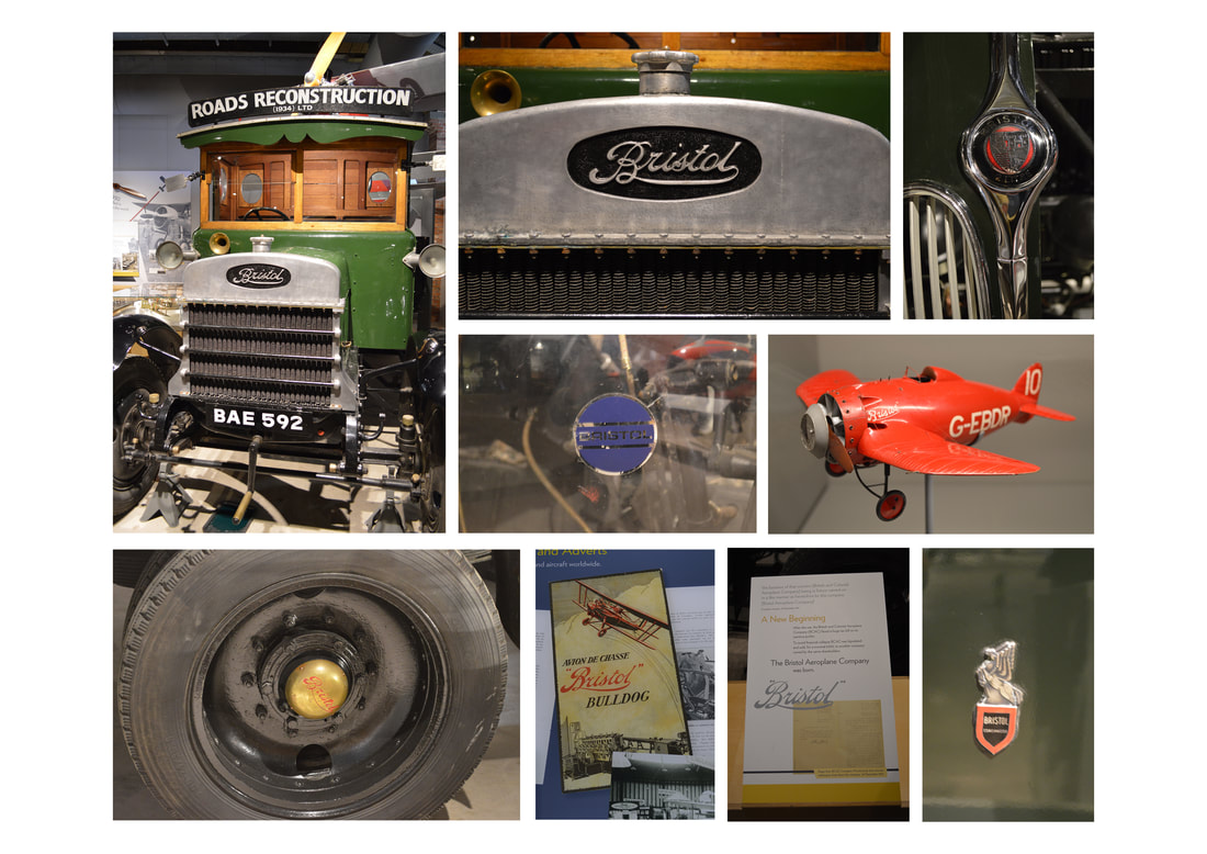
The Aerospace Museum had different vehicles with variations of the Bristol Transport logo.
The Aerospace Museum had different vehicles with variations of the Bristol Transport logo.
27th April - Logo Development
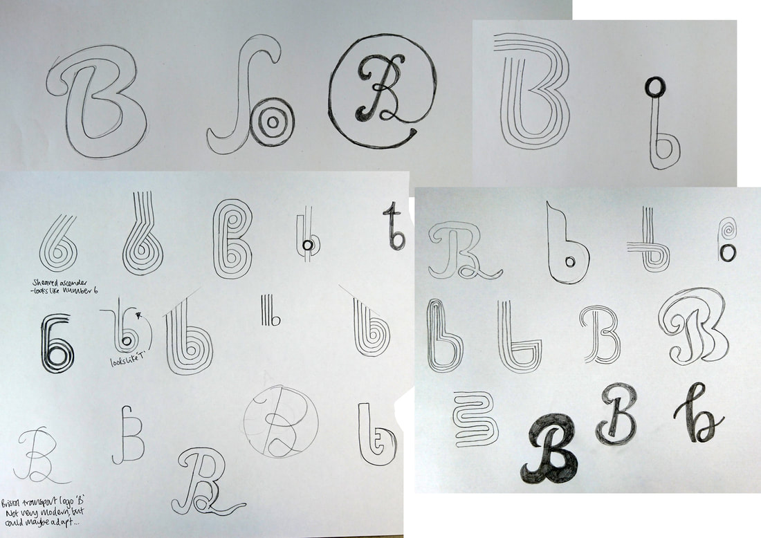
I initially wanted to use the classic style of the Bristol transport logo but decided that it would not suit a modern system. I experimented with different B's and accompanying typography for 'Bristol Tram' as a company. Eventually I settled on a lowercase B with lines to represent the line network. I also used the company name 'Bristol Tramways' as a nod to the old company and I thought it sounded and looked better.
At the moment the colours are based on the old trams themselves, but it may not be modern enough.
9th May
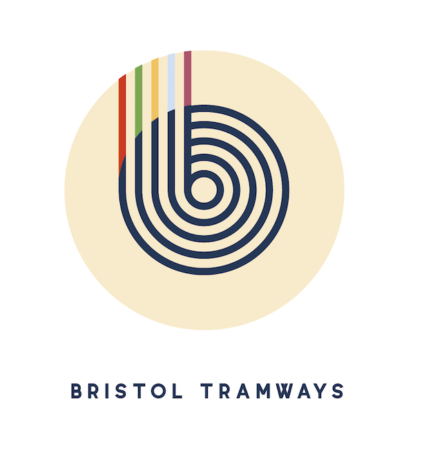
When applying the logo to vehicle livery, it wasnt working so I decided to look at various 2/3 tone colour variations. Also, Penny suggested adding colours from various lines to see how that looked. Eventually I settled on the two blues seen below which compliment each other, are modern and simple.
When applying the logo to vehicle livery, it wasnt working so I decided to look at various 2/3 tone colour variations. Also, Penny suggested adding colours from various lines to see how that looked. Eventually I settled on the two blues seen below which compliment each other, are modern and simple.
This is my final choice for the Bristol Tramways Network logo.